 1 / 6
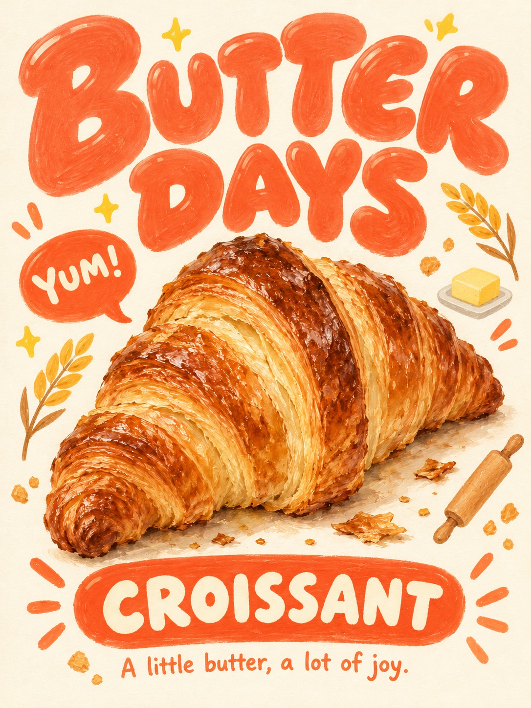
1 / 6Photo to Cute Character Poster: Bubble Letters on Cream Paper
Turn a photo's subject into a chubby hand-drawn character poster on cream paper, with oversized bubble lettering, gouache-pastel texture, and themed decorations.
Full prompt
Overall Instruction Reinterpret the main subject in the attached photo according to the visual rules below, and create one cute, lively illustration poster in a 3:4 vertical format. Take the subject's identity and characteristics from the photo; the poster's art style and design follow the instructions below. [Optional Inputs — leave blank for auto] - Top title: - Bottom name: - Short caption: - Speech bubble: - Preferred accent color: - Anthropomorphism (yes / no): [1. Overall Art Direction] On bright cream-colored paper: a chubby protagonist, oversized bubble lettering, tiny flowers and sparkles — a kitschy character poster that looks entirely hand-drawn. The overall feel is an art print from a lovable, lively stationery brand. Colors are vivid, forms are soft and round, and both the letters and the artwork are large. The artwork carries the tactile hand-feel of soft pigment, while the letters are painted more smoothly and solidly than the artwork. Deliver both a polished character illustration and a tidy poster design. [2. Preserving the Subject in the Photo] Make the single most important subject in the photo — or the few closely related main subjects — the visual focus. Keep the silhouette, signature colors, patterns, facial features, and key parts or props that make the subject recognizable. You don't need to reproduce the original photo's background. Food: keep the type, shape, layers, and toppings, and turn it into a chubby, cute character. If it suits, add tiny eyes, a smiling mouth, pink cheeks, and short little hands and feet. Product: keep the form and main parts, and reinterpret corners and proportions more softly. If it suits, add a small expression and hands/feet, but do not obscure the product's important structure. Do not invent new brands or logos. Animal: keep the fur color, markings, and the ear and face features. Make the head slightly larger, the body and paws chubby, and the expression and gestures adorable. Person: keep the facial impression, skin tone, hairstyle, clothing, and accessories. Render as a cute fashion illustration with a round face, expressive eyes, soft cheeks, and a lively expression. Preserve the original person's age range and distinctive character. Landscape: keep the main buildings, terrain, vegetation, and the character of the place. Compose it like a charming miniature world where houses, trees, paths, and natural elements blend together. Present the scene as one cohesive illustration spreading naturally across the paper ground. Existing character: prioritize preserving the character's own design — eyes, nose, mouth, ears, markings, proportions, and props. Do not replace an already defined eye shape and expression with the face of some other common character. If the user specifies whether to anthropomorphize, that instruction takes priority. [3. Art Style of the Main Illustration] Render the protagonist with broad, soft curves, chubby masses, and a clear silhouette. Simplify the forms, but keep enough of the characteristic details that show the subject's charm. Paint it to look like a blend of opaque gouache and soft oil pastel. Fill broad areas of color fully, then leave short, soft strokes where pigment layers overlap. Let a subtle paper grain show through in only parts of the color fields. Warm light-to-dark color shifts are allowed to convey roundness, but do not use photographic shading or digital airbrush gradients. Render fur, hair, bread layers, and the like with short, directional brushstrokes. Avoid rough pencil hatching, dense scribbled lines, and sparse smudged dry-crayon coloring. Internal lines describing the face and key parts may be used naturally. Do not outline the overall silhouette with a thick, uniform black line. [4. Top Title — the Most Important Design Element] Make the top title in very thick, chubby hand-drawn bubble lettering. Each letter is round and wide as if filled with air, with soft corners and stroke ends. Use short, thick strokes, tiny counters (inner spaces), and generous letter width. Do not make it thin handwriting or an elongated standard typeface. Arrange the text in 1–2 lines, broken at natural word boundaries. The title block should occupy about 85–90% of the poster's width. Give the whole word group a softly rising curve and a springy rhythm. Leave just enough space between letters to distinguish them, yet keep it reading as one cohesive title. Vary individual letter size and tilt only slightly; do not twist them randomly. Fill the letters almost completely with one vivid accent color. Leave only a very faint pigment texture on the surface. You may add small, short cream-colored curved highlights on top of some letters. The highlights are flat little brush marks, not 3D gloss. The letter outlines are formed by the fill color itself. Do not add black lines, white outlines, ivory borders, or offset lines outside the letters. [5. Layout] A single finished poster in a 3:4 vertical ratio. Top ~25–30%: place the large bubble-lettering title. Middle to lower ~55–60%: place the main character illustration large. The protagonist takes up about 70–85% of the poster width and becomes the center of the image. Use a full-body or natural half-body composition for people or objects, and one wide scene for landscapes. Bottom ~10–15%: place the small rounded color-block label and one short caption line. Keep the gap between the title and the protagonist naturally close. Use the empty space on either side of the protagonist for decorations. Compose the frame richly and vividly, yet leave breathing space between all elements. Leave about a 5% safe margin at the poster's edges, and do not crop the text or main subject. [6. Bottom Label and Caption] Below the protagonist, place a horizontally long, capsule-shaped color-block label with rounded ends. Inside the label, put the name or keyword in chubby cream-colored capital letters. The label must be clearly smaller than the top title. Optionally add 2–3 short accent dashes on each side of the label. Place one short caption line below the label. The caption uses a small but highly legible, round and thick handwritten style. The caption color ties to the title color or the palette's accent color. Do not make the caption an excessively small, dense block of explanatory text. [7. Decorations] Decorations are rendered as small but distinct hand-painted color shapes. Identify the subject's type, traits, use, and mood in the photo, then choose props and symbols specifically related to that subject as decorations. Do not repeat flowers and hearts as default decorations for every subject. Food: use small props related to the food's ingredients and making process. For example, for bread use wheat ears, a pat of butter, a rolling pin, and crumbs; for fruit desserts, the corresponding fruit and leaves; for drinks, pick fitting elements from raw ingredients, ice cubes, and small glasses. Product: use props and symbols related to the product's function and user experience. For example, for a camera use a film roll, film strip, small photo frames, and aperture symbols; for audio products, musical notes and sound waves; for perfume, elements related to the actual fragrance ingredients. Use flowers only when they relate to the product or its ingredients. Animal: use elements related to the animal's traits, play, and habitat. For example, for a cat use paw prints, a ball of yarn, and small toys; for a dog, a ball, paw prints, and walking gear; for a bird, pick fitting elements from feathers and leaves. Person: use elements that match the outfit, expression, accessories, and overall mood. If the mood is lovely, flowers, hearts, and sparkles may be used. If the photo reveals a hobby or activity, prioritize related props. Landscape: use plants and local elements naturally found at that place. For a beach, shells, waves, and the sun; for mountains and forests, leaves, pinecones, and clouds; for a city, architectural details and small elements symbolizing the location. Existing character: choose decorations from the character's props, patterns, and lore. For example, if the character has a clover, use small clovers and symbols of luck — connecting to the character's own traits. Do not mechanically repeat the examples above; choose according to the actual attached photo. Pick 2–3 kinds of themed decorations and place about 4–6 main decorations. If needed, add soft-ended sparkles and short accent dashes as supporting elements. Don't make each decoration too tiny; render them at a medium size much smaller than the protagonist. Place them on the left and right of the protagonist at varying sizes and heights. Put short accent dashes in small clusters near the speech bubble or label. Do not scatter extremely tiny symbols all over the frame. You may place one round color-block speech bubble next to the protagonist. The bubble has a short tail and short, thick cream-colored text. Decorations and the speech bubble must not overlap the main subject and hide its important features. [8. Color and Paper] The ground is bright, warm cream-colored paper. Express the paper texture so subtly it is almost imperceptible. Do not add dark borders, yellowed aged-paper effects, or strong stains. Keep the protagonist's original colors. Combine that with one vivid title color and 2–3 accent colors for decorations. You may choose colors that suit the subject from cobalt blue, turquoise, hot pink, orange, lilac purple, clear green, and vivid yellow. Decide the title color anew for each subject. It should harmonize with the protagonist's colors while creating enough contrast. Don't make both the letters and decorations green just because the protagonist has a green prop. Do not fix one particular letter color — such as red or pink — across all subjects. Even when using multiple colors, repeat the same accent color to unify the whole. [9. No Outlines / Borders] Do not add white or ivory bands around the main subject, title, flowers, stars, hearts, sparkles, or speech bubble, as if they were cut out like a sticker. Do not add thin lines that follow the element's outer edge at a constant offset, double outlines, halos, or offset borders. All color shapes must meet the cream paper ground directly. Keep the artwork's own internal descriptive lines and natural color boundaries. [10. Automatic Copy Setting] If the user provides a title or name, use it exactly as spelled. Do not change a specified name to another name or substitute a new nickname. Only when no copy is specified: make the top title a witty 2–4 word English phrase matching the subject's personality; the bottom label a short 1–3 word English name or keyword; the caption one lovely, concise English sentence. Make the speech bubble a short greeting, exclamation, or onomatopoeia. Express each phrase accurately and legibly. Do not include signatures, watermarks, unnecessary logos, or long explanatory text. [Final Check] - Does the subject's distinctive character remain? - Is the title wide, chubby bubble lettering fully filled with color? - Is the protagonist a cute illustration with a soft pigment texture? - Are the decorations placed clearly at the right size? - Do the bright paper ground and vivid accent colors harmonize? - Is there no unnecessary thin outlining around the elements? Output one finished poster image reflecting all of the above conditions.
How to use
Attach a photo with one clear subject — a person, pet, food, product, or landscape — and its silhouette, colors, and signature features are preserved as a chubby character. Use the optional inputs to set the top title, bottom name, caption, speech bubble, accent color, and anthropomorphism; leave them blank for auto-generated English copy. Output is a 3:4 vertical poster; title color and decorations adapt to the subject, so fine-tune based on actual results.