AI Paper Cut Art Generator – Trending Prompts & Templates
Experience the online AI paper-cutting generator, which has built-in popular cases and prompts, and turn your photos into stunning paper-cutting art in a few seconds.
Use Cases
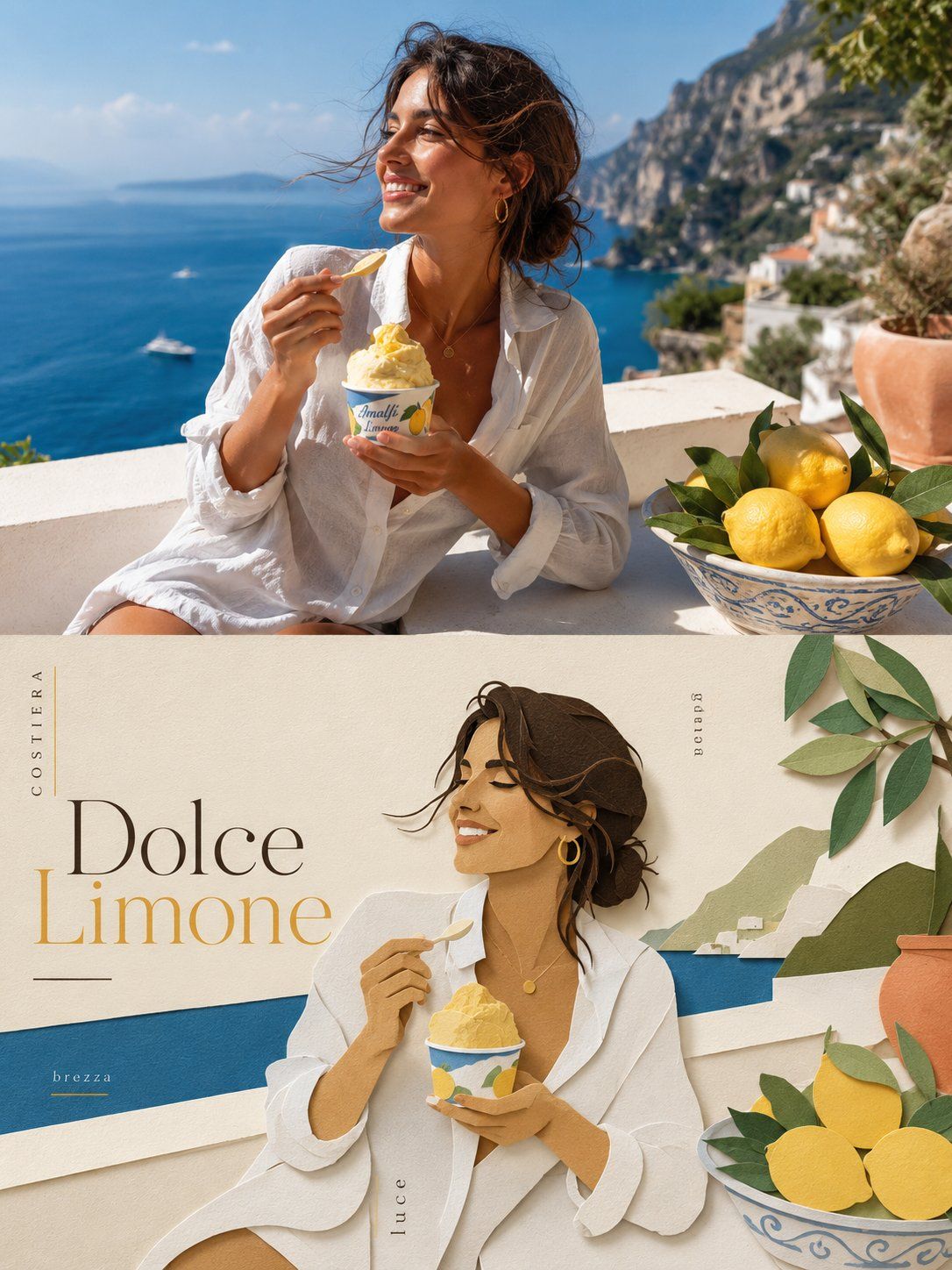
Portrait Paper Cut Art
Please turn each photo I upload into a separate, standalone premium design poster. Do not create multi-image collages; each photo must be output individually. Use an overall 3:4 vertical composition, with the upper and lower sections divided in a strict 1:1 height ratio, each occupying exactly 50% of the canvas. The upper half should preserve the original photograph, maintaining the subject’s structure, realistic texture, natural lighting, and original color atmosphere. Apply only subtle, high-end photographic color grading so that the image feels like an art magazine, independent publication, or exhibition photograph. To adapt the image to the required aspect ratio, you may naturally extend the sky, ground, or surrounding environment, but do not stretch, distort, or alter the subject itself. The lower half should extract the most recognizable subject, silhouette, pose, and narrative relationship from the photograph and reinterpret them as a minimalist, handcrafted layered paper-cut and paper-sculpture collage. Use one core subject as the visual anchor, simplifying its essential silhouette, proportions, and structure through folding, cutting, layering, and overlapping rather than mechanically reproducing every detail. Then select only a small number of environmental relationships from the original image and transform them into foreground, midground, and background paper layers. Establish clear hierarchy through differences in scale, compositional axes, positive and negative space, front-to-back overlap, and generous areas of empty space. The subject should remain immediately recognizable while maintaining the restraint, precision, and order of contemporary editorial design. Extract the most distinctive and energetic colors from the upper photograph and translate them into a limited, harmonious paper color palette. Use warm ivory or a light-toned paper surface as the base, then create spatial depth with a dominant color, a darker structural tone, lighter layering tones, and only a very small amount of accent color. Use refined matte cardstock with visible paper fibers, crisp cut edges, and soft contact shadows. Lighting should be naturally diffused to emphasize the thickness of folded layers and the authentic tactile quality of handmade paper. Avoid plastic-looking 3D rendering, cheap craft-paper aesthetics, neon colors, and complex gradients. Create a complete high-end editorial micro-typography system. Based on the subject’s identity, location, action, material, mood, or symbolic meaning, derive one short main title, accompanied by 2–4 groups of very small supporting text. These may flexibly combine the object or subject name, location information, numbering, chapter markers, serial numbers, coordinate-style numerals, directional words, status words, material descriptors, category labels, or one extremely short poetic annotation. Do not use years or dates. The main title should provide recognition and emotional tone, while the small text should create structure, rhythm, sophistication, and editorial precision. Typography must be composed together with the paper-cut graphics rather than placed separately. Text may follow the edges of paper layers, the contour of the subject, geometric axes, or negative space. It may also appear horizontally, vertically, rotated, widely tracked, aligned tightly to edges, anchored into corners, crossing color blocks, embedded between paper layers, or partially obscured and interwoven with the main subject. The main title may be moderately transformed into paper-cut or folded-paper letterforms, while the supporting typography should remain thin, restrained, and contemporary. Use strong contrasts in type size, direction, and orientation to create a deliberate reading path, so that the paper artwork creates the visual memory while the micro-typography creates the premium editorial order. The overall visual language should combine real photography × handcrafted paper cutting × high-end editorial design. The result should feel clean, elegant, tactile, contemporary, refined, and collectible. Regardless of whether the subject is a person, animal, plant, architecture, object, vehicle, or natural landscape, always maintain one primary subject, a limited number of paper layers, generous negative space, and precise micro-typography. Avoid childish craft aesthetics, excessive visual stacking, duplicated subjects, e-commerce presentation styles, and obvious template-like compositions.
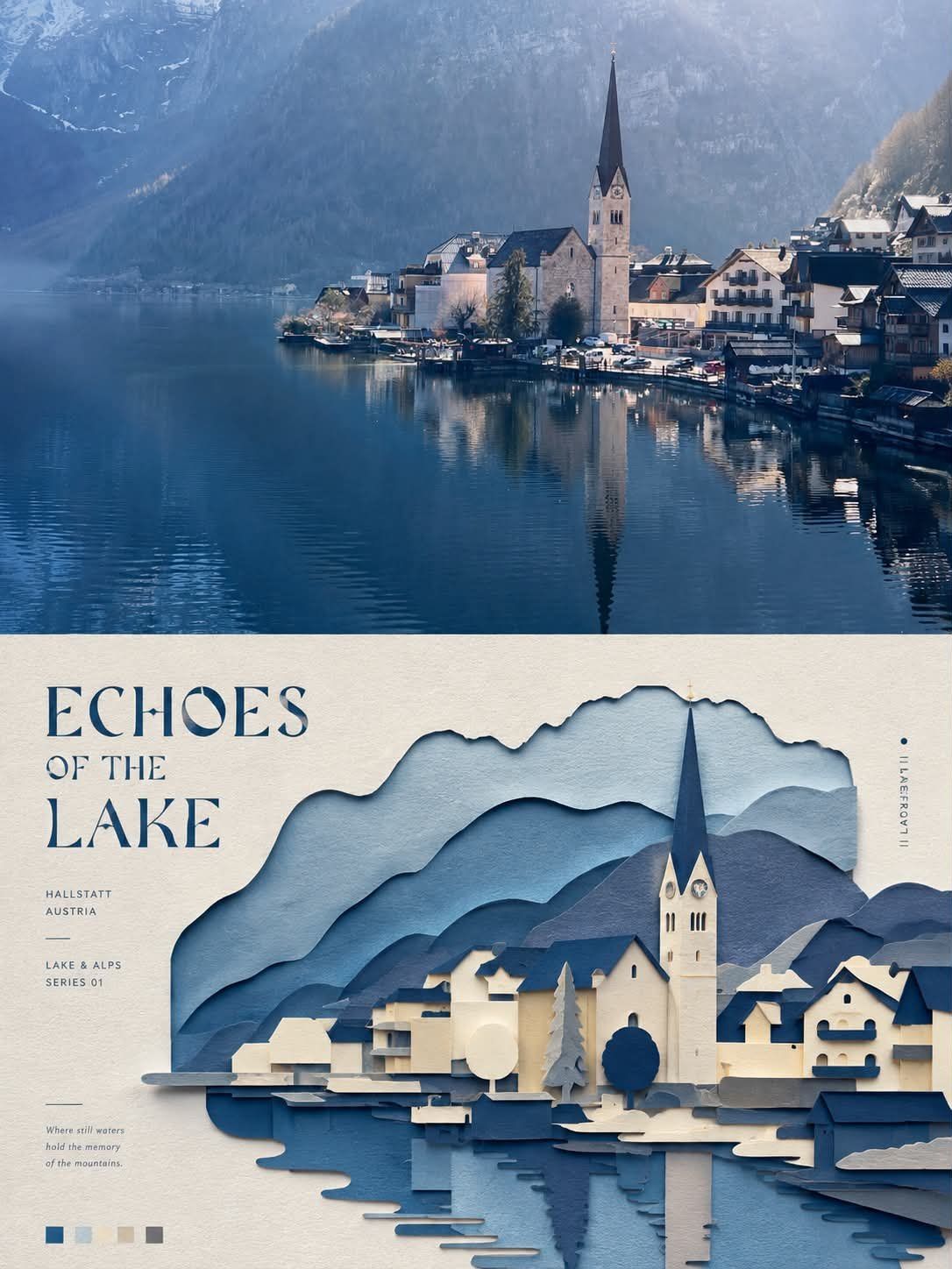
landscape Paper Cut Art
Please turn each photo I upload into a separate, standalone premium design poster. Do not create multi-image collages; each photo must be output individually. Use an overall 3:4 vertical composition, with the upper and lower sections divided in a strict 1:1 height ratio, each occupying exactly 50% of the canvas. The upper half should preserve the original photograph, maintaining the subject’s structure, realistic texture, natural lighting, and original color atmosphere. Apply only subtle, high-end photographic color grading so that the image feels like an art magazine, independent publication, or exhibition photograph. To adapt the image to the required aspect ratio, you may naturally extend the sky, ground, or surrounding environment, but do not stretch, distort, or alter the subject itself. The lower half should extract the most recognizable subject, silhouette, pose, and narrative relationship from the photograph and reinterpret them as a minimalist, handcrafted layered paper-cut and paper-sculpture collage. Use one core subject as the visual anchor, simplifying its essential silhouette, proportions, and structure through folding, cutting, layering, and overlapping rather than mechanically reproducing every detail. Then select only a small number of environmental relationships from the original image and transform them into foreground, midground, and background paper layers. Establish clear hierarchy through differences in scale, compositional axes, positive and negative space, front-to-back overlap, and generous areas of empty space. The subject should remain immediately recognizable while maintaining the restraint, precision, and order of contemporary editorial design. Extract the most distinctive and energetic colors from the upper photograph and translate them into a limited, harmonious paper color palette. Use warm ivory or a light-toned paper surface as the base, then create spatial depth with a dominant color, a darker structural tone, lighter layering tones, and only a very small amount of accent color. Use refined matte cardstock with visible paper fibers, crisp cut edges, and soft contact shadows. Lighting should be naturally diffused to emphasize the thickness of folded layers and the authentic tactile quality of handmade paper. Avoid plastic-looking 3D rendering, cheap craft-paper aesthetics, neon colors, and complex gradients. Create a complete high-end editorial micro-typography system. Based on the subject’s identity, location, action, material, mood, or symbolic meaning, derive one short main title, accompanied by 2–4 groups of very small supporting text. These may flexibly combine the object or subject name, location information, numbering, chapter markers, serial numbers, coordinate-style numerals, directional words, status words, material descriptors, category labels, or one extremely short poetic annotation. Do not use years or dates. The main title should provide recognition and emotional tone, while the small text should create structure, rhythm, sophistication, and editorial precision. Typography must be composed together with the paper-cut graphics rather than placed separately. Text may follow the edges of paper layers, the contour of the subject, geometric axes, or negative space. It may also appear horizontally, vertically, rotated, widely tracked, aligned tightly to edges, anchored into corners, crossing color blocks, embedded between paper layers, or partially obscured and interwoven with the main subject. The main title may be moderately transformed into paper-cut or folded-paper letterforms, while the supporting typography should remain thin, restrained, and contemporary. Use strong contrasts in type size, direction, and orientation to create a deliberate reading path, so that the paper artwork creates the visual memory while the micro-typography creates the premium editorial order. The overall visual language should combine real photography × handcrafted paper cutting × high-end editorial design. The result should feel clean, elegant, tactile, contemporary, refined, and collectible. Regardless of whether the subject is a person, animal, plant, architecture, object, vehicle, or natural landscape, always maintain one primary subject, a limited number of paper layers, generous negative space, and precise micro-typography. Avoid childish craft aesthetics, excessive visual stacking, duplicated subjects, e-commerce presentation styles, and obvious template-like compositions.
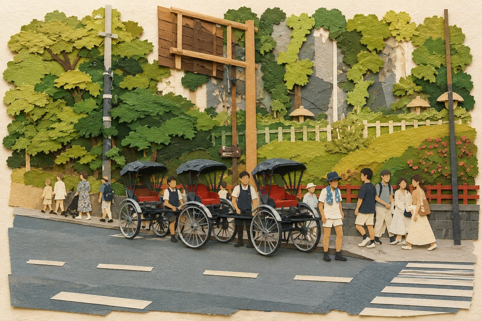
Layered Paper Cut Art
将输入的**任意参考图像**重新诠释为一幅**手工制作的层叠纸质拼贴插画(handmade layered paper collage)**。整体呈现温暖、可爱、怀旧、富有童趣的现代绘本纸艺风格。 ## 核心转换原则 首先理解参考图中真正重要的视觉信息,并保留: - 主体身份与主体数量 - 人物或动物的姿态、动作与朝向 - 人物之间、人物与物体之间的关系 - 关键服装、发型、配饰与具有辨识度的特征 - 核心物体 - 基本构图、空间方向与场景含义 **不要逐像素复制照片,也不要简单给照片覆盖纸张纹理。** 将整个真实场景重新设计成一幅**完全由不同颜色、厚度和纹理的手工纸片剪裁、撕裂、拼接和层层叠放而成的纸质插画**。 最终画面中不得残留任何真实摄影元素。 --- ## 人物与主体 如果参考图中有人物,将人物完整转换成**纸片拼贴人物**。 人物不是照片剪下来贴在纸面上,也不是写实的 3D 玩偶,而是由多个独立纸片组合而成: 头发、帽子、脸部、脖子、上衣、袖子、手臂、手掌、裤子、腿、袜子、鞋子等,都使用不同形状和颜色的纸片分别剪裁并叠加。 保留参考人物最重要的: - 身体比例 - 动作姿势 - 四肢方向 - 头部朝向 - 简化后的表情 - 发型与帽子 - 服装轮廓 - 服装主要颜色 - 鞋子与重要配饰 但进行适度绘本化和可爱化概括。 **不要生成真实皮肤。** 脸部使用暖米色、浅棕色或柔和肤色纸张表现,仅通过极少量纸片形状、浅压痕或简单剪纸结构暗示鼻子、嘴巴、耳朵和眼睛。 人物五官保持非常简洁,不追求照片级面部细节。 衣服同样必须明显表现为纸张,而不是真实布料。可以利用压纹纸、粗纤维纸、细条纹纸、皱纹纸等不同纸张纹理暗示针织衫、裤子、袜子和鞋子的材质。 人物整体保持**扁平的浅浮雕纸艺结构**。 **shallow bas-relief, not sculptural, not a figurine** 不要把人物制作成圆润、完整立体的玩偶。 --- ## 纸张材质 所有元素必须具有清晰可见的真实手工纸张质感: - 粗糙纸纤维 - 手工纸颗粒 - 轻微褶皱 - 压纹 - 不均匀表面 - 毛茸茸的纸边 - 手工剪裁边缘 - 少量自然撕裂边缘 - 微小纸张厚度 纸张不能过于光滑或数字化。 边缘不要全部使用完美的矢量曲线。 保留轻微的不规则、歪斜和手工误差,让观者能够明显感觉到这些元素是**人工剪纸和撕纸制作出来的**。 --- ## 层叠与立体效果 整个作品采用**浅浮雕式层叠纸艺结构**。 不同纸片之间具有真实可见的高度差: 背景纸 → 大型环境纸片 → 地面与建筑 → 植物或装饰 → 人物身体 → 衣服 → 手脚 → 帽子、头发、鞋子等局部细节 纸片之间产生非常柔和、自然的接触阴影。 阴影主要出现在纸片边缘下方,让人能够看到纸张是**一层一层贴上去的**。 立体程度保持克制。 画面应该像一幅放置在桌面上、从正面拍摄的精致手工拼贴作品,而不是一个完整的立体微缩模型。 --- ## 场景简化 不要忠实复制参考照片中的全部环境细节。 对真实场景进行明显的信息压缩。 复杂建筑、树林、街道、室内环境、家具、石头、水面、车辆等,都转换成**少量大块纸片形状**。 删除: - 杂乱背景 - 重复物体 - 微小纹理 - 摄影噪点 - 复杂反射 - 精细建筑结构 - 不重要的远景 - 无关杂物 只保留能够帮助观者理解原始场景的必要环境元素。 例如: 树木可以简化成绿色纸片树冠 + 简单树干; 道路可以简化成一两层灰色或灰蓝色横向纸条; 墙壁可以变成大面积米白色手工纸; 水面可以变成几层浅蓝色撕纸; 山体可以变成层叠的不规则纸片轮廓; 建筑可以只保留最具有辨识度的几何结构。 --- ## 背景与构图 使用**干净、温暖的白色或奶油白色手工纸**作为整个作品的基础背景。 背景必须能够看到细微的天然纸张纤维和轻微的不均匀纹理。 保留参考图原本的大致构图关系,但允许适度增加留白,让画面更加像一本儿童绘本中的独立插画页面。 主体仍然是视觉中心。 不要让新增装饰改变原照片的故事含义。 --- ## 装饰元素 在不破坏原始场景的情况下,可以在画面空白区域加入少量可爱的手工剪纸装饰: - 小花朵 - 雏菊 - 郁金香 - 小星星 - 云朵 - 心形 - 小圆点 - 简单叶片 这些元素同样必须由独立纸片制作。 花瓣、花蕊、叶子可以使用不同颜色的小纸片叠加形成。 装饰元素应该**零散、克制、不完全对称**,像手工制作绘本时随意加入的小装饰。 不要密集填满背景。 不要让花朵、爱心或星星抢过主体。 如果原场景本身已经比较复杂,应进一步减少装饰元素。 --- ## 色彩 整体采用**低饱和、温暖、复古的绘本配色**。 优先使用: 米白 奶油白 燕麦色 暖灰 灰蓝 鼠尾草绿 橄榄绿 砖红 陶土红 柔和棕色 芥末黄 灰粉色 淡橙色 避免高饱和荧光色。 颜色之间保持柔和协调,并尽可能继承参考图主体原本最具有辨识度的颜色关系。 --- ## 光线与阴影 使用柔和自然的漫射光。 光线类似阴天窗边或专业工作室中拍摄纸艺作品的柔和自然光。 纸片边缘产生轻微方向一致的柔软投影。 阴影应该帮助表现: **纸张厚度、纸片层级、手工拼贴关系。** 不要使用强烈电影光影。 不要使用戏剧化逆光。 不要产生真实人物摄影式的皮肤高光。 --- ## 最终视觉效果 最终作品应该让人第一眼就能够辨认出参考图中的主体、动作和故事,但第二眼会明显发现: **整幅画完全是由真实手工纸张剪裁、撕裂和层层粘贴制作出来的。** 整体感觉: **handmade layered paper collage, dimensional cut-paper illustration, torn-edge paper craft, shallow bas-relief paper art, handcrafted children's picture-book aesthetic, tactile fibrous paper texture, layered paper pieces, subtle paper thickness, soft contact shadows, imperfect hand-cut edges, warm nostalgic colors, whimsical and playful, charming handmade imperfections** 强调: **这是“纸片拼出来的世界”,不是“真实世界变成纸质材质”。** ## 必须避免 不要照片写实 不要保留真实照片皮肤 不要真实布料 不要真实头发丝 不要真实道路或墙面纹理 不要把真人照片直接剪贴进画面 不要仅仅添加纸张滤镜 不要塑料质感 不要黏土风格 不要毛毡风格 不要羊毛毡 不要陶瓷质感 不要橡皮泥 不要完整 3D 玩偶 不要圆润的 3D 卡通人物 不要微缩模型 / miniature diorama 风格 不要过强景深 不要摄影级真实材质 不要完美矢量边缘 不要复杂背景 不要过度装饰 不要密集花朵 不要文字 不要 Logo 不要水印 **最重要:保持二维拼贴画 + 轻微纸张厚度形成的浅浮雕效果。所有人物、环境和装饰都必须明显由独立的手工纸片组成,具有可见纸纤维、不规则剪裁或撕裂边缘以及柔和的层叠阴影。**
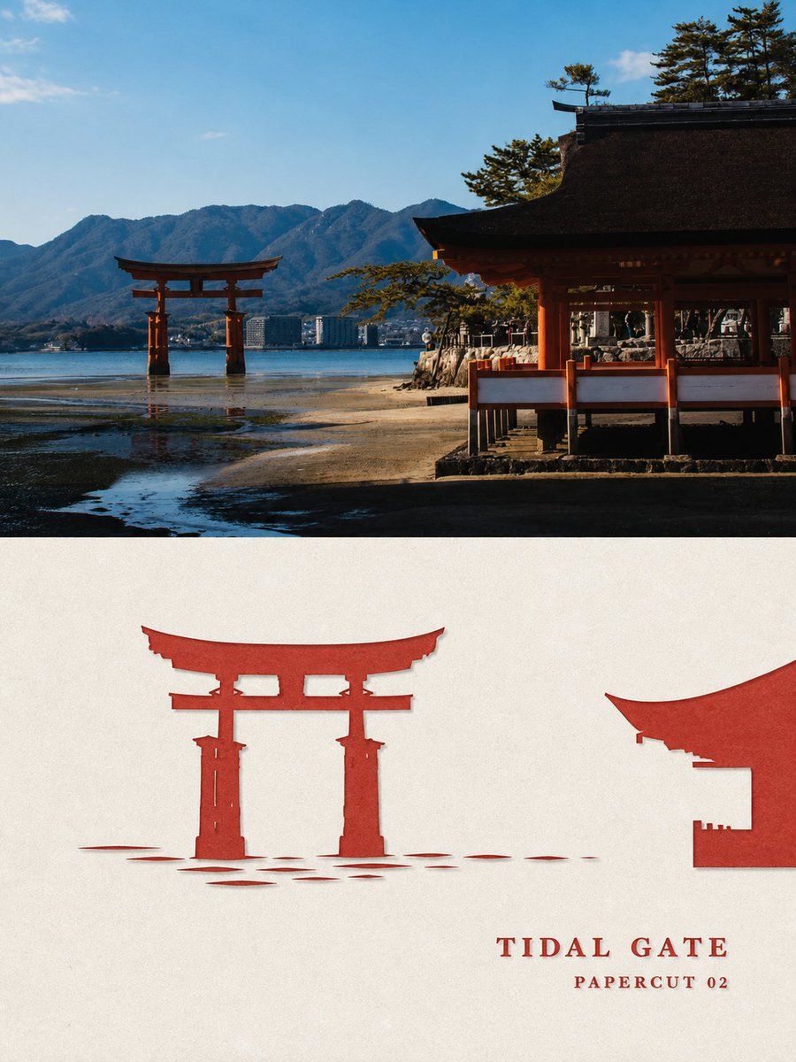
Traval Paper Cut Art
Please turn each photo I upload into a separate, standalone premium design poster. Do not create multi-image collages; each photo must be output individually. Use an overall 3:4 vertical composition, with the upper and lower sections divided in a strict 1:1 height ratio, each occupying exactly 50% of the canvas. The upper half should preserve the original photograph, maintaining the subject’s structure, realistic texture, natural lighting, and original color atmosphere. Apply only subtle, high-end photographic color grading so that the image feels like an art magazine, independent publication, or exhibition photograph. To adapt the image to the required aspect ratio, you may naturally extend the sky, ground, or surrounding environment, but do not stretch, distort, or alter the subject itself. The lower half should extract the most recognizable subject, silhouette, pose, and narrative relationship from the photograph and reinterpret them as a minimalist, handcrafted layered paper-cut and paper-sculpture collage. Use one core subject as the visual anchor, simplifying its essential silhouette, proportions, and structure through folding, cutting, layering, and overlapping rather than mechanically reproducing every detail. Then select only a small number of environmental relationships from the original image and transform them into foreground, midground, and background paper layers. Establish clear hierarchy through differences in scale, compositional axes, positive and negative space, front-to-back overlap, and generous areas of empty space. The subject should remain immediately recognizable while maintaining the restraint, precision, and order of contemporary editorial design. Extract the most distinctive and energetic colors from the upper photograph and translate them into a limited, harmonious paper color palette. Use warm ivory or a light-toned paper surface as the base, then create spatial depth with a dominant color, a darker structural tone, lighter layering tones, and only a very small amount of accent color. Use refined matte cardstock with visible paper fibers, crisp cut edges, and soft contact shadows. Lighting should be naturally diffused to emphasize the thickness of folded layers and the authentic tactile quality of handmade paper. Avoid plastic-looking 3D rendering, cheap craft-paper aesthetics, neon colors, and complex gradients. Create a complete high-end editorial micro-typography system. Based on the subject’s identity, location, action, material, mood, or symbolic meaning, derive one short main title, accompanied by 2–4 groups of very small supporting text. These may flexibly combine the object or subject name, location information, numbering, chapter markers, serial numbers, coordinate-style numerals, directional words, status words, material descriptors, category labels, or one extremely short poetic annotation. Do not use years or dates. The main title should provide recognition and emotional tone, while the small text should create structure, rhythm, sophistication, and editorial precision. Typography must be composed together with the paper-cut graphics rather than placed separately. Text may follow the edges of paper layers, the contour of the subject, geometric axes, or negative space. It may also appear horizontally, vertically, rotated, widely tracked, aligned tightly to edges, anchored into corners, crossing color blocks, embedded between paper layers, or partially obscured and interwoven with the main subject. The main title may be moderately transformed into paper-cut or folded-paper letterforms, while the supporting typography should remain thin, restrained, and contemporary. Use strong contrasts in type size, direction, and orientation to create a deliberate reading path, so that the paper artwork creates the visual memory while the micro-typography creates the premium editorial order. The overall visual language should combine real photography × handcrafted paper cutting × high-end editorial design. The result should feel clean, elegant, tactile, contemporary, refined, and collectible. Regardless of whether the subject is a person, animal, plant, architecture, object, vehicle, or natural landscape, always maintain one primary subject, a limited number of paper layers, generous negative space, and precise micro-typography. Avoid childish craft aesthetics, excessive visual stacking, duplicated subjects, e-commerce presentation styles, and obvious template-like compositions.
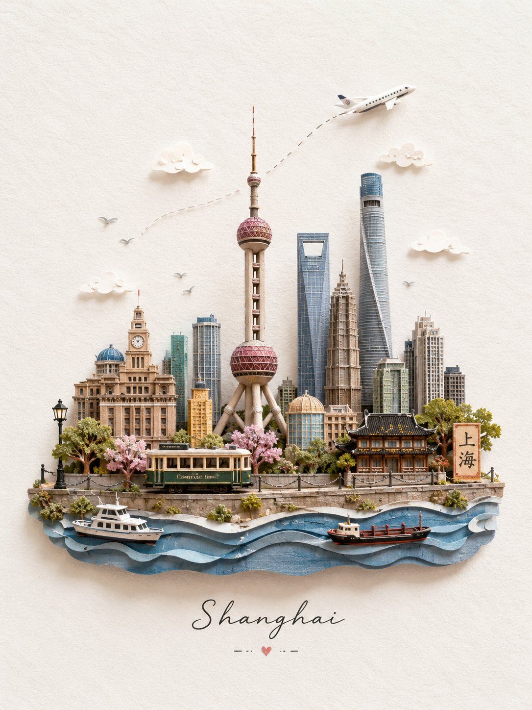
City Paper Cut Art
Create a charming miniature 3D paper-craft travel illustration of [Destination], designed as a delicate handmade travel postcard. Use only the destination name to identify the location, then feature its most recognizable local landmarks, architecture, and cultural elements as tiny handcrafted models arranged naturally on a narrow floating landscape strip. Include charming miniature details that reinforce the destination, such as authentic local transportation, trees, street lamps, pathways, water, birds, clouds, and a small airplane with a subtle dotted flight path. Keep every landmark recognizable and geographically appropriate to the destination. Use a soft white textured paper background with gentle natural lighting, pastel colors, soft shadows, and a clean airy composition. Make the miniature elements appear handcrafted from layered paper, clay, wood, cardstock, and other delicate craft materials, with tactile textures, tiny details, subtle imperfections, and realistic miniature depth. Keep the scene centered and elegant with generous negative space around the floating landscape strip. Add a small refined handwritten-style title at the bottom reading “[Destination]”. Style: miniature diorama, handcrafted paper art, whimsical 3D illustration, travel postcard, soft pastel palette, tactile craft textures, macro photography feel, delicate details, cozy artistic aesthetic, realistic miniature depth, high resolution, vertical 3:4 composition.
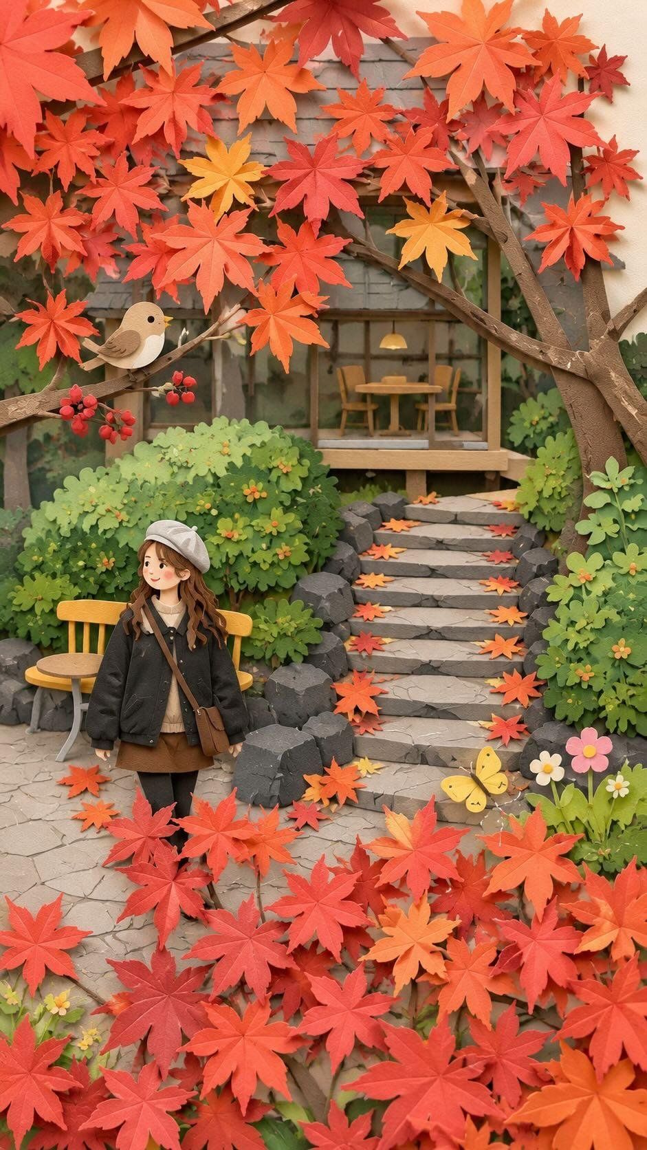
paper craft style
Recreate this image in a paper craft style, simplifying the details to make them suitable for paper craft artwork. Arrange the overall composition to feel visually pleasing, soft, and cute. You may add charming decorative elements such as birds, butterflies, flowers, etc., to enhance the adorable atmosphere while still matching the original image.
How to use AI to generate paper-cut art?
- Open the current paper-cutting workflow
- Upload your own photos
- Use the built-in popular paper-cut prompt words to generate directly. You can also adjust the prompt words or enter your own prompt words to generate.
- Wait for it to be generated and download it locally. If you are not satisfied, you can continue to edit and regenerate in the canvas.
FAQ?
- Can it be generated for free?
Can! Each new user will receive 10 experience credits to experience our AI generation capabilities. - Do I have to upload pictures?
unnecessary! We provide Tusheng paper-cutting and Vincent paper-cutting cases, and you can directly use prompt words to generate them. - Can the generated paper-cut image be used for commercial purposes?
Yes! The paper-cut works created using our AI are very suitable for commercial purposes, including greeting cards, book illustrations, and social media. Each paper cutout is unique and ready for commercial use. - What type of photos are best suited for paper cutting art?
Any photo will do! You can refer to our cases to create, especially portraits, landscapes, travel, street photography, etc.
Ready to start creating?
Open the template in Oimi Canvas to view the full prompts and workflow.